Resource
Customers are connecting to banks and credit unions online with increasing frequency, so it’s essential that your website stands out from the competition. Luckily, it’s becoming easier for banks and credit unions of all sizes to have beautifully-designed websites that function effectively. We’ve updated our favorites list, in no particular order, to highlight those websites that we believe truly stand out. Read on to discover some of the top banking websites from 2024.
Want more financial marketing insights and best practices? Join 2,142 other financial marketers subscribed to the BankBound blog, or our growing LinkedIn community.
Alliant Credit Union
Website: https://www.alliantcreditunion.org/
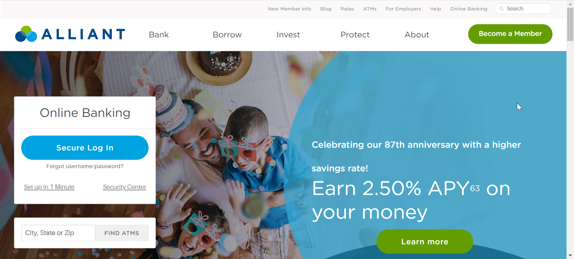
This is one of our top picks for a good reason. From the moment you arrive on the homepage, this website establishes trust and authority while guiding users to the information they need. Clean and simple navigation, clear calls-to-action for members and non-members, an eye-catching monthly payment savings calculator right on the homepage, links to helpful blog articles, real customer testimonials, and ample contact information. All these elements work together to create a pleasant and informative experience.
Delving deeper into the site, we can see that the internal pages maintain the clean and contemporary design of the homepage. Each product page is highly informative and built to convert; from the moment we land on the auto loans page, we’re given four conversion points above the fold (before we scroll further down the page). Loan features, a handy calculator, an in-depth description of the application process, rates, frequently asked questions, and customer reviews are used to make each page a comprehensive experience. There are a few reasons why so many of the bank websites on this list utilize user reviews, namely the fact that positive reviews make 91% of consumers more likely to use a business.
Ally
Website: https://www.ally.com/
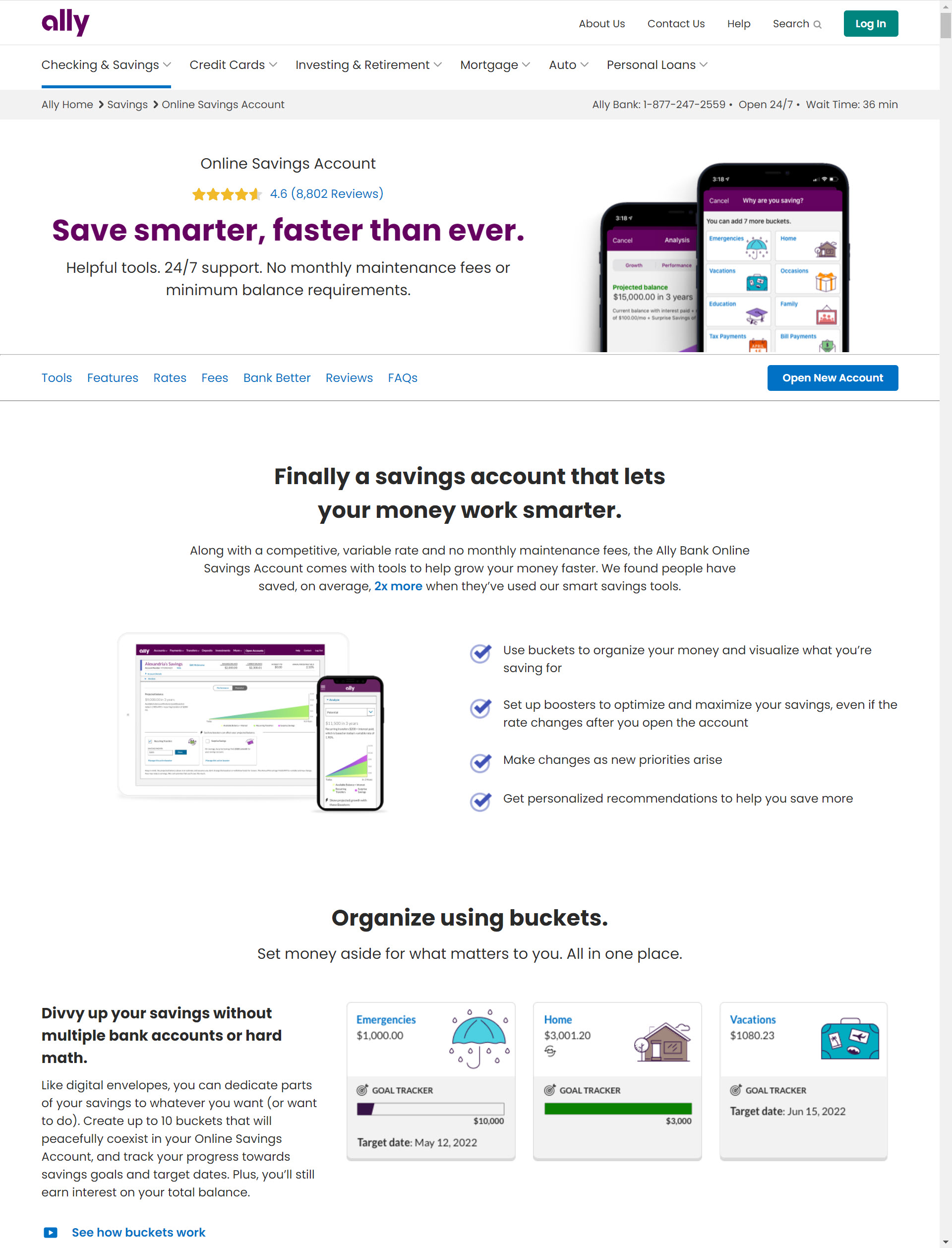
If your FI is leveraging Search Engine Optimization and Pay-per-Click advertising to accelerate website engagement, your users are primarily going to arrive on your site via internal pages (rather than the homepage where most existing customers arrive). With that in mind, let’s take a look at Ally’s personal savings account page. Imagine that you just clicked on an ad to open a personal savings account, and this is the page you’ve landed on. Right away, you can see the APY, valuable features, excellent user reviews, and a link to open an account. Scrolling further down the page, we’re given even more information about rates and earnings compared to their top competitors, a clear breakdown of fees, frequently asked questions, and a few reasons why Ally is different from other FIs.
Bremer Bank
Website: https://www.bremer.com/
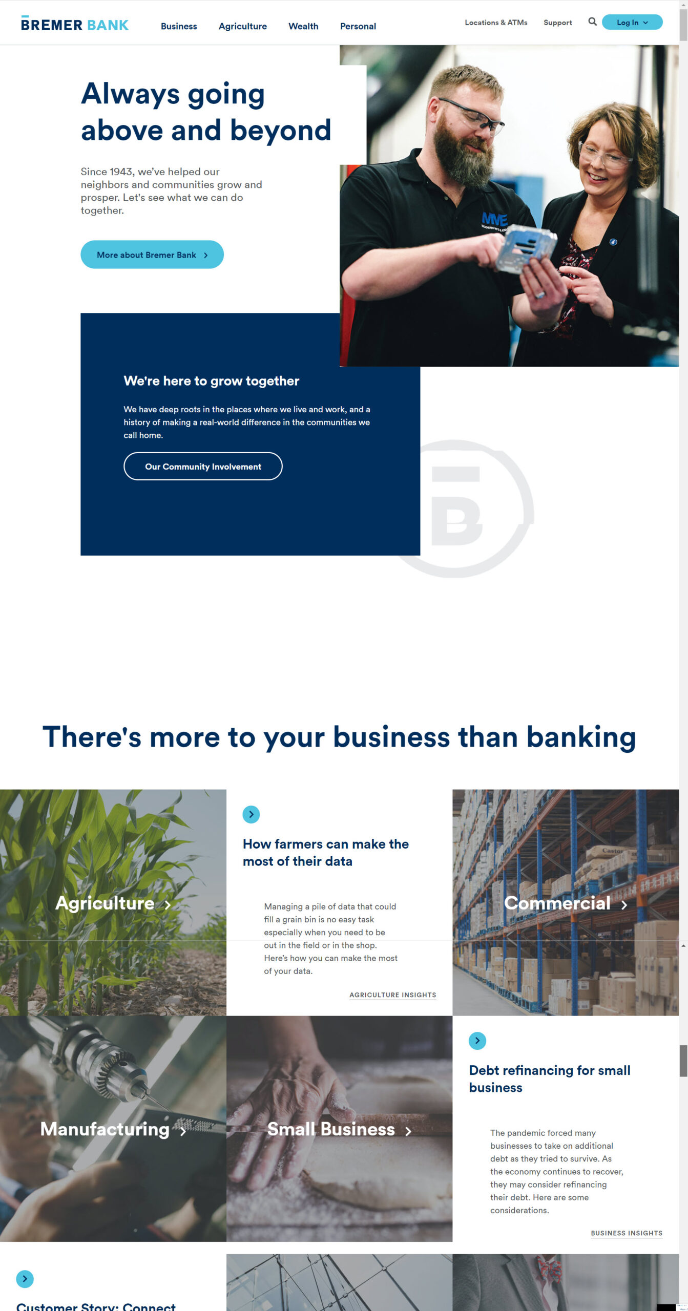
From the opening of the home page, the Bremer Bank website is all about professionalism and “Always going above and beyond” as their opening message states. The blue and grey color palette plays off nicely from the Bremer Bank logo. This along with the compartmentalization of information into a grid like design helps provide a visually appealing experience as well as easy navigation to key information, segmented to meet customer needs.
Lone Star National Bank
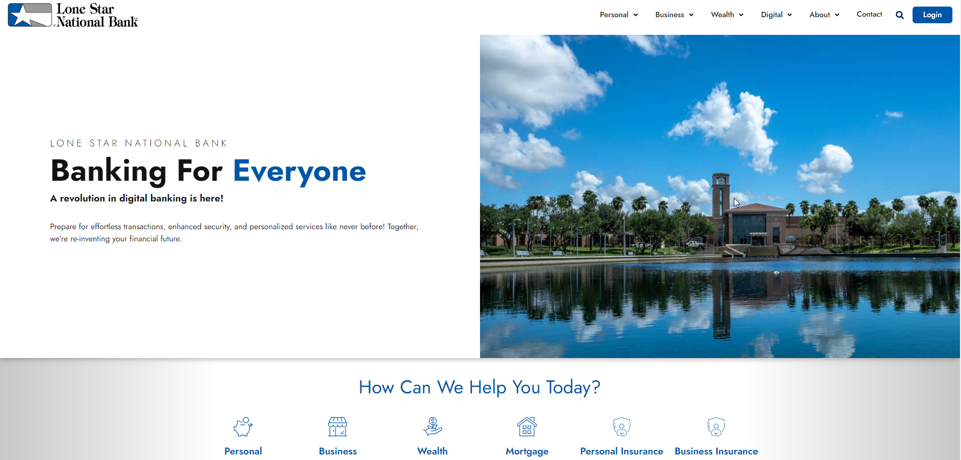
Lone Star National Bank’s website showcases a user-friendly design with clear navigation paths for personal, business, and wealth banking services, facilitating easy access to relevant information. The site is optimized for SEO through descriptive, keyword-rich titles and headings, enhancing visibility in search engine results. It incorporates mobile responsiveness, ensuring a seamless experience across various devices. The inclusion of contact information, location finders, and a login portal at prominent positions further enhances user engagement and accessibility. Overall, its strengths lie in straightforward navigation, mobile optimization, and effective SEO practices, supporting both user experience and search engine discoverability.
PenFed Credit Union
Website: https://www.penfed.org/
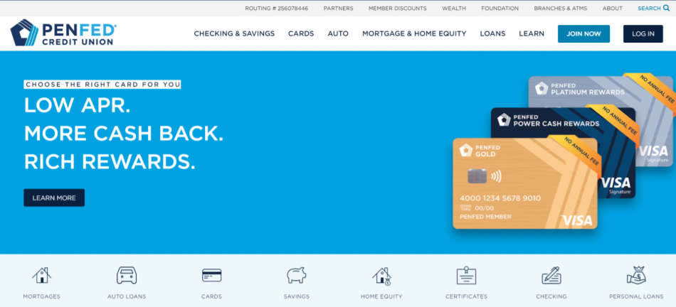
PenFed Credit Union is another website that utilizes clean navigation and also includes a customer testimonial section as a standout feature on their site to help establish trust. Images of real people provide an opportunity to capture attention and build engagement. They are able to reinforce their credibility and commitment to customer education by providing links to helpful blogs and pages that explain the benefits of membership. A simple navigation and a series of easy-to-recognize icons help guide users through the site.
Texas Capital Bank
Website: https://www.texascapitalbank.com/
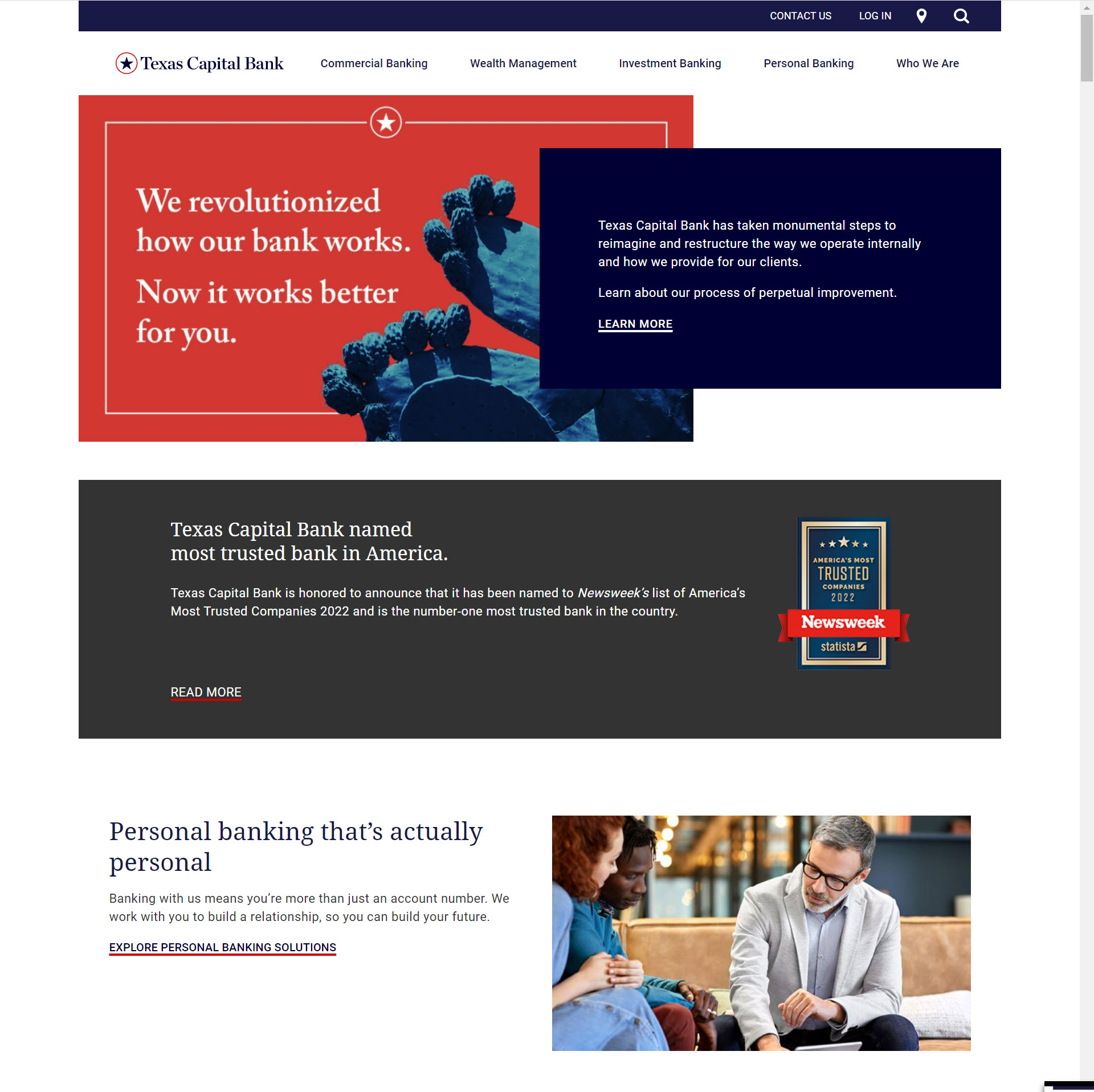
This website has a clean, professional and modern responsive design, but what really sets it apart from the others on this list is their attention to effective content. In addition to building generic pages for each of their products, Texas Capital has created individual content pages targeted to specific industries. Each of these pages explains how Texas Capital can assist businesses in those industries and provides contact information for professionals at the bank who have experience working with those types of businesses. So, not only are these pages designed to convert, but they will help Texas Capital rank higher in the search engine results for industry-specific keywords.
Aside from those unique content pages, the site itself is doing just about everything correctly. It has a slick responsive design, trust signals from Newsweek on the homepage, clear calls-to-action, ongoing content creation that is relevant to their audience, and multi-level navigation that helps their visitors find what they need quickly.
South Georgia Banking Company
Website: https://www.sgbconline.com/
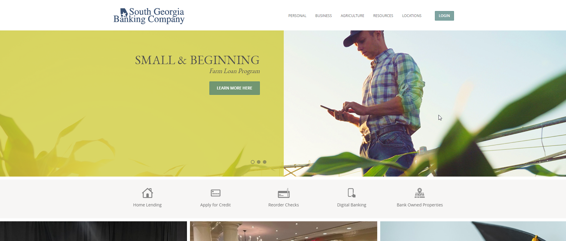
The South Georgia Banking Company website stands out with its focused approach to community banking, showcasing tailored financial services for personal, business, and agricultural needs. It emphasizes local engagement and personalized service, evident in its user experience design that facilitates easy navigation to specific services and resources. The website’s responsiveness and accessible design ensure a good user experience across devices
Union Savings Bank
Website: https://www.unionsavings.com/
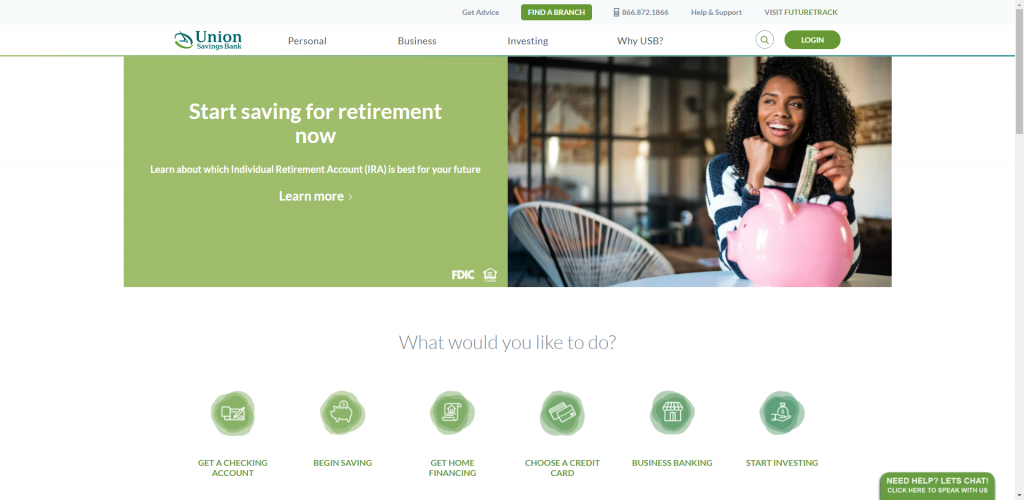
Union Savings Bank presents their products and services based on what prospects could be looking for by asking, “What would you like to do?” This section of their home page enables users to find the right path toward the solution to their search. Their home page navigation options describe their offerings objectively while also communicating their dedication to their community.
Local First Bank
Website: https://localfirstbank.com/
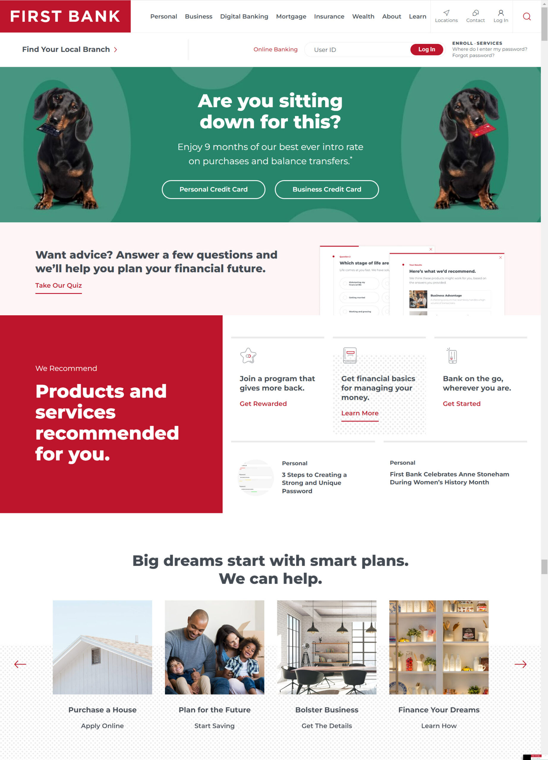
First Bank’s home page begins with a prominent header that direct users to their branch location map. It follows that up with the latest opportunities front and center and then recommended services based on the current demand, such as banking anywhere, mobile deposits, and their online mortgage calculator. If the dropdown menu was not the navigation option of choice for the user, the next section of their home page also breaks down their products by the problem that they solve, with examples being Purchase a House, Plan for the Future, Bolter Business and Financing Your Dream options. For the readers that have enjoyed scrolling down the home page a bit already, they round it out with quick tutorials, testimonials, and a Trending Topics section to highlight their top recent blog posts.
Byline Bank
Website: https://www.bylinebank.com/
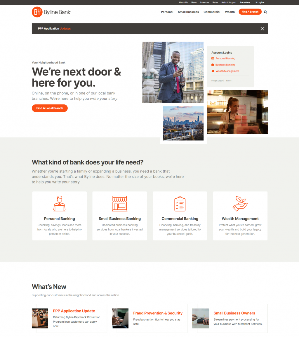
Byline Bank doesn’t over state the site with their brand’s orange color, instead using it as an accent in key areas such as the call-to-action buttons. This in contrast to the backdrop remaining mostly grayscale helps to bring the users attention to where it matters most, without overwhelming them with too much vibrance. The bold font helps with getting their message across so prospects do not need to look for too long to find what they need. They also promote their latest blog content nicely as a follow-up section to their product and service highlights.
What Makes These Websites Effective?
Your website is the face of your company online, and it’s the first impression that many people will have of your bank or credit union. We all know that first impressions are important, but this is even more true online, since users rate the visual appeal of a website and form brand opinions within 0.05 seconds! Couple this with the fact that consumers have high standards when it comes to online content, and the importance of website design becomes obvious.
Each of the websites we’ve showcased is doing a great job of building trust, providing information, and guiding their visitors with an exceptional user experience. These are some of the biggest factors in creating an effective website design. Let’s explore what these websites have in common to determine why they are so effective from a design standpoint.
Aesthetics
The appearance of your website says a lot about your brand, and how you’re perceived by potential customers. In fact, research from Adobe has shown that 38% of consumers will stop engaging with a website if it’s unattractive, and researchers at the British Computer Society discovered that 75% of judgements of a website’s credibility are based on aesthetics! If your website is outdated, this is sending a subconscious negative message to your audience, and it could have a lasting impact of their perception of your financial institution for years to come. A crisp and clean website design is a powerful tool to build a positive experience for your visitors, establish trust in your brand, and show them why you are a step above your competitors. Although each of the websites shown above are using different styles, they all have a modern appearance that will appeal to the average visitor.
Make sure your website is designed to reflect both your business and your brand. It should connect with your visitors easily by making a visual link between your print material, logo, and your physical location. Having a website that is well-designed and built to enhance the credibility of your brand will help boost its popularity.
Navigation
Visual appeal is an extremely important aspect of website design. It has the power to help you build lasting relationships with your customers and differentiate yourself from the competition. However, it’s essential you put the functional foundations in place first. Your website must be findable, usable and accessible.
Imagine trying to drive somewhere when you’ve been given terrible directions. You’d be frustrated, confused, and you might even give up on the trip altogether! The same can be said for your digital audience – if they can’t find the information they’re looking for quickly and easily, they’ll give up and look for the information on a different site. This is why a proper navigation is so important: it allows your visitors to get the information they need without needing to hunt for it. There are several best-practices for website navigation to provide an optimal user experience for your visitors:
- Your navigation should be consistent throughout your website
- Tabs should be accurately and clearly labeled
- Use drop-down menus help to create a streamlined navigation experience
- Utilize links within your website content to lead people to different internal pages
- Avoid putting too many links in your menus
Each of the websites we’ve chosen to highlight above have different approaches to navigation. However, they are all following best-practices that make it easy for visitors to find what they need.
Information
When visitors come to your website, they are usually looking to find the answer to a question. What does it take to apply for a mortgage? What are the rates on their high-interest CD account? How do their loan rates stack up against local competitors? The content on your website should be focused around providing answers to questions that your audience is asking, then driving them to submit an application, call a lender, send you an email, or take some sort of action that has a measurable value. Providing them with the tools they need to do business with you in an easy and enjoyable way will increase your website conversion and bring you the kind of success you seek.
Don’t forget that many of your prospective visitors will enter your website on a product or location page; you may have the best bank home page ever designed, but don’t assume your visitors will see it. You’ll note that every website we’ve featured in this article goes above and beyond to provide valuable information throughout their website – and then give their visitors a clear next step to lead them further through the sales funnel.
Web-Friendliness
No matter how informative, beautiful, and easy to use your website design is, it’s useless unless it’s web-friendly. It is important that your web designers know the keys to making your website work on all the major browsers, and that they utilize meta tags, alt tags, are fully versed in SEO (Search Engine Optimization). Many factors impact your search engine placement and visual appearance of your site, so make sure your web designers know their stuff.
Mobile-Optimized
Searches from mobile devices have been steadily growing year after year. Google has confirmed that more searches take place on mobile devices than on desktop computers, so it’s becoming increasingly important to provide a great user experience for these mobile users. A responsive website – that is, a site that automatically scales to fit the device you’re using – is an essential part of creating a mobile-friendly experience. How important is it? Well, 73% of consumers say that content must display well on the device they’re using. Otherwise, 33% of those users said that that they will stop engaging with the content altogether.
Mobile-friendliness and ultimately mobile banking should be a major part of your bank’s digital marketing plan. According to The Financial Brand, 65% of consumers who use online banking also use mobile banking, and that number continues to grow. In 2024 and beyond, banks must provide their customers with alternative ways to perform banking transactions. As phsysical branch locations continue to close, consumers need to rely on the mobile deposit function in banking apps to deposit checks into their accounts. This feature alone demonstrates the value of a digital bank branch. It has become increasingly important for banking options to be available both on a computer and a mobile phone.
Why Partner with BankBound?
In the digital age, an effective website design is more important than ever. However, for banks and credit unions, it’s important that you partner with a web design company that understands the financial industry. At Bankbound, we specialize in providing marketing as well as website design services for banks and credit unions. It’s all we do, so we have the unique insight into your needs that other design firms lack while providing an individualized level of service that banking core providers can’t match with templated website designs that are difficult to manage. Take some time to explore our comprehensive design and digital marketing services for FIs or get in touch to start a conversation about your specific needs.
