Website Design
So, you’ve overhauled your website with a bright new look and feel, some fresh images, and a revised color palette. You can officially sit back and relax because that’s going to draw the attraction of new customers from all over your market… right?
Here’s a secret — although all of the work you’ve done is critical to presenting your financial institution in the most positive way, there’s so much more you can do to enhance its digital presence and make the money and time you’ve put into the project truly pay off.
(If you’re thinking about a new website redesign right now, this info is for you, too).
Now, let’s take a closer look at six ways you can optimize your newly redesigned website to increase online visibility, engagement, and leads for your financial institution.
1. Search Engine Optimization (SEO)
The new look of your redesigned website is often the main focus of any redesign project. We often hear from financial marketers that the primary goal of their redesign was to give the website a more modern, updated look since the previous version had been around for a while and felt “dated”. Having a modern design is definitely important to ensure the bank’s digital presence is representing the institution as a credible and competitive organization. However, the aesthetics of a website don’t help increase online visibility, traffic, and leads.
Google uses a lot of variables to determine which websites appear on the first page of search results for a particular search query or keyword.

Many elements that help Google understand and prioritize your website ahead of another financial institution in search results may have been addressed during the website redesign process. This is often true of many technical elements that are best practices for search engine optimization, including mobile-friendliness and Core Web Vitals.
So can you check SEO off your to-do list once the website is redesigned? Nope.
Think of SEO like a farm, the more work you put into maintaining and optimizing the farm, the greater the yield. During the initial redesign process you’ll want to address the following elements at a minimum to ensure the website is optimized for search engines:
- Analytics and goal tracking
- ADA compliance
- Broken links and broken pages
- Copywriting to support target keywords
- Domain unification
- Header tags
- Image alt text
- Internal linking
- Keyword research
- Metadata (page titles and descriptions, canonicals, robots.txt)
- Site architecture
- Sitemaps
Once these items are knocked out, ongoing optimization is needed to maintain and improve organic visibility, traffic, and leads from search engines like Google. Ongoing SEO efforts for your bank website should include the following at a minimum:
- Competitor analysis
- Conversion rate optimization
- Copy adjustments and enhancements
- Inbound/educational blog content creation
- Local listings management (especially Google My Business)
- Metadata enhancements (titles, schema markup, more)
- Online review marketing
- Promotion and optimization of published blog posts
- Remediation of broken links and pages
- Target keyword monitoring and refinement
SEO is an investment that yields exponential results over time and should be given as much consideration as the website design. After all, what good is a shiny new website if prospects aren’t finding it!
2. Conversion Rate Optimization
 In a nutshell, conversion rate optimization (CRO) means doing everything you can to get as many visitors to your shiny new website to do exactly what you want them to do when they visit. Along with Google Analytics, Google Optimize can help you improve lead generation—which could range from asking for more info, downloading content, requesting a demo, opening an account or any other action you’d like your website visitor to complete.
For example, if you have a page that describes your best checking account, you want everyone who reads about it to tap or click the Open an Account button you’ve also added to that page. (You do have one there, right? If not, go add that first.)
Here’s what you’ll want to do next:
- To start, use Google Analytics or some other analytics tool, to identify which pages on your site get the most web traffic. Then, you’ll want to take a closer look at those pages to learn how people are getting to them.
For example, is most of your traffic organic (stemming from solid search engine optimization), or does it come from pay-per-click advertising? Are your live chats, emails, and social posts driving site visits? You might be surprised at where your traffic is coming from—and how it may differ from page to page.
- Once you’ve identified the pages and channels that are most successful, you’ll want to zero in on those to best move the needle. Build out some form of a content calendar for these pages. This allows you to keep them fresh with current information that keeps visitors coming back while giving you a chance to generate solid leads. Including forms on these pages, let’s gather real relevant information about prospects while enticing them with additional information.
However, don’t add a form for the sake of adding a form. Make sure your forms go hand-in-hand with the page content as well as a call-to-action that won’t scare people away. For example, rather than a lengthy account opening form (something that can be handled with a simple button that’s much less intimidating to a prospect), you could add a simple “Want More Information?” form to each of your current account or product pages. Similarly, a simple subscription form can be added to your news, blog, and financial education pages—a soft-sell approach to getting new prospects in the pipeline.
- You can promote free whitepapers, budget spreadsheets, or other downloadable resources on your site in exchange for user information. The easiest way to accomplish this is to build out signup forms (on which you’ll obtain a prospect’s name, email address, and other details) then use that info to deliver the resource(s) the prospect is interested in.
- Finally, let’s circle back to calls-to-action (CTAs). These are simple statements that give site visitors a clear understanding of what they’re doing and what their “next step” should be. Contact Us, Open an Account, Learn More, Subscribe… CTAs like these all leave no question as to what action will result from their usage. When it comes to CTAs, the simpler, the better.
3. Content Marketing
We’ve already mentioned content in brief, but let’s take a moment to dive into the types of content your financial institution can provide. In addition to product and services descriptions, there’s so much more that can drive prospects to your site—even if they’re not in the market for a new bank or credit union.
Most FIs have basic product descriptions on their website, but to outrank competitors with similar products you’ll need to go further. Think of each page on your website as the first and last impression a prospect will have with your bank or credit union. It’s crucial that all product pages are descriptive enough to answer all the questions a prospect might have about the product, what it can do for them, and also why your FI is their best option.
Increasing online visibility and engagement with your product pages should be a primary objective for your 24/7 branch, but keep in mind there are only so many people in your market searching for financial products and services. There is a great deal more who are searching online for help with managing their personal or business finances. Educational content written specifically for your target audiences and your target geographic markets offers even the smallest financial institutions the opportunity for exponential visibility and engagement online. If you’re not already blogging, you should be.

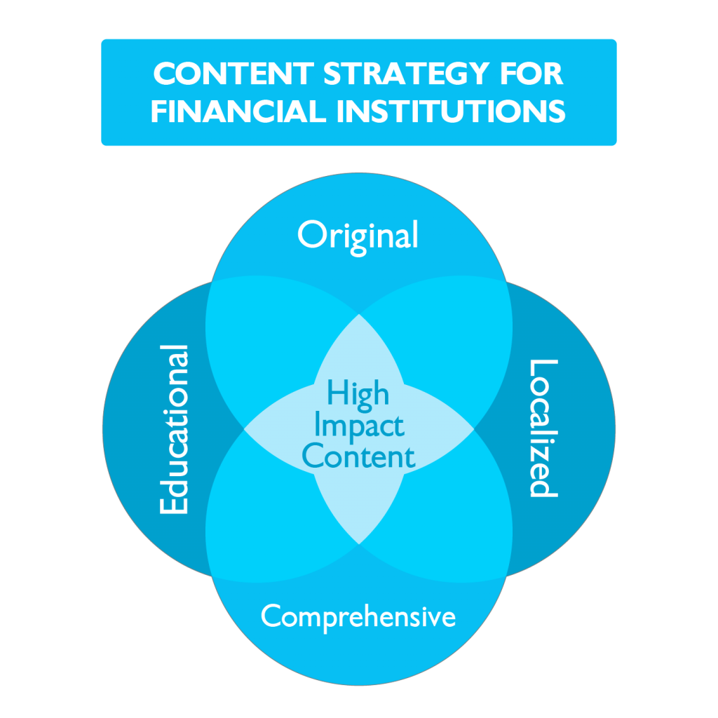
By producing content that is original, localized, and educational, your financial institution is building credibility with customers, prospects, and Google. This type of content is the fuel that makes all of your digital marketing channels more effective: organic, email, social, and even advertising.
4. Email Marketing Automation

Want to stay top-of-mind with prospects or customers who aren’t hitting your website every week? An email automation campaign will allow you to deliver focused information directly to their inboxes—at whatever cadence you’d like.
Let’s say you’ve been able to gather contact details through website visits, resource downloads, or contact forms. That information is like gold. Now’s your chance to tailor campaigns to individual groups of people based on exactly where they are in the customer journey.
How can marketing automation enhance your FI’s website?
- Increase engagement
- Increase leads
- Increase lead conversion rates
Here are a few examples of “set-it-and-forget-it” email automation:
- A simple “thank you” message that goes out to any prospect who’s reached out to your FI for assistance, inviting them to join your social media pages or subscribe to future communications.
- A series of blog posts and informational pieces around HELOCs, tailored specifically to those who asked for more information in the last six months. You could vary these from a customer feature story to a news article about rates or a human-interest, stat-focused article on the top ways people use HELOCs.
- Biweekly onboarding emails for new checking account holders to ensure they know how to use specific FI features like mobile check deposit, online bill pay, or simply changing their password.
- A monthly aggregation of all blog posts your FI has published over the last month, teasing each piece with a link that takes them back to the actual post on your site.
The possibilities are endless, but the goal is simple: personalized and timely communications with your target audiences.
5. Website Technical Health

Any time you redesign a website, the majority of work actually goes into what your site visitors can’t see. So, it’s as important to maintain the technical integrity of your website, its code, and other back-end features that help search engines crawl your site and, subsequently, rank you against other similar sites.
In today’s world, people access websites on computers, phones, watches, and even tools like Amazon Alexa. That means it’s more important than ever to make sure you’ve optimized the metadata of your website— code that helps search engines interpret key page content like images, addresses, headings, titles, and more. We often find financial websites have completely generic metadata, limiting their visibility in search engine results.
Here are two other ways to give your site a quick checkup:
- If traffic seems to have dropped since you launched your new site, there are a few things to look for. For example, is analytics tracking code installed on every page on your website? How about Google Tag Manager?
“No matter what analytics platform you use—Google Analytics, Adobe Analytics, Piwik, Clicky, and so on—there is some kind of site-wide code these platforms use to track how users interact with your site,” said Direct Online’s Jonathan Bentz. “Without it, analytics tools have no way of recording traffic data.”
- Check for errors. Tools like ScreamingFrog can help you review page errors and search for broken or missing pages, missing metadata, headers, noindex/nofollow pages, and malformed links.
While you’re at it, review user engagement, too. In addition to analytics, you’ll want to make sure you’re tracking things like conversion events, automation, and pixels (little bits of code that let you gather details about what your site visitors are doing on a particular page.)
Here are a few more ways to optimize your site for all users:
Make your website responsive. Ever looked at a website that looks great at work, but terrible on your phone or tablet? That means it wasn’t built with responsive design in mind. If your site is hard to read or navigate across devices, people aren’t going to use it—especially when it comes to mobile banking and similar account services. Responsive design is also important from a generational perspective, as millennials and Gen Z prospects and customers alike tend to use smartphones to go online with much more frequency than past generations.
6. Backlinks

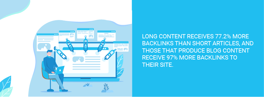
Backlinks are simply links that go from one website to another, but they mean the world when it comes to your FI’s online credibility with search engines like Google.
If you link to, say, FDIC.gov, they have a backlink from your financial institution. And, if you got them to link to you, you’d have a backlink from them. That’s a good thing since the FDIC is an extremely credible website that Google already views as authoritative.
“Search engines like Google see backlinks as votes of confidence,” said Ahref.com’s Joshua Hardwick. “Generally speaking, the more votes your web pages have, the more likely they are to rank for relevant search queries.”
And, the more “votes” you have, the higher you’ll rank and the more visibility your site will have when people are searching for specific products, features, or services. So, the more quality backlinks you can accumulate, the better off you’ll be. Here are a few ways to increase backlinking.
- Start by claiming all your local listings (for every branch and your headquarters) on sites like Google My Business and Bing Places.
- These local platforms will help build trust between your website and other pages that come up in search results. Even if your FI has been around for a century or more, this is the first step toward improving your digital credibility.
- Next, talk to your business customers. From a content perspective, this is a great opportunity to highlight local business owners in feature stories or blog posts, and have them a link from their business page to your website—creating backlinks. After all, you make them look good and they’ll spend time and resources promoting your content on their site and social media channels, which sends even more people back to your FI’s page.
- Add your listing to online financial directories or RSS feeds. Similar to the “yellow pages” approach we talked about a moment ago, being listed in relevant, market-focused directories will help give you increased credibility online.
- Active your FI’s subject matter experts to write content on other websites where you can link back to your own. For example, your lending or treasury team members could write content for local online newspaper editorials, a local college alumni website, or perhaps for a local real estate agency.
We’re Here to Help Grow Your FI
![]() Website redesigns (and post-design optimization) don’t have to be scary or overwhelming. Whether you’re just thinking about a refresh or want to make sure your existing website generates more engagement with prospects, contact us at BankBound for help or specific ideas to support your digital presence. Talk with a digital strategist to get a digital marketing analysis of your financial institution today!
Website redesigns (and post-design optimization) don’t have to be scary or overwhelming. Whether you’re just thinking about a refresh or want to make sure your existing website generates more engagement with prospects, contact us at BankBound for help or specific ideas to support your digital presence. Talk with a digital strategist to get a digital marketing analysis of your financial institution today!

